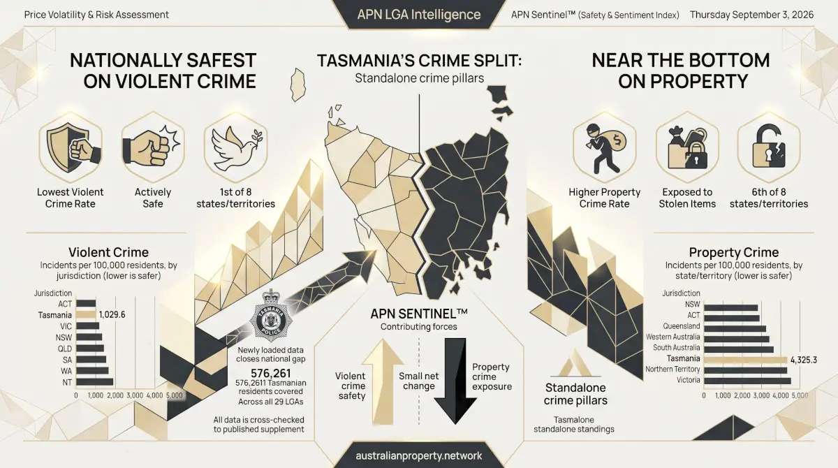

The council-area crime rates behind this piece have been corrected, and the piece has not yet been rewritten. Rates are now calculated on the ABS estimated resident population at 30 June 2025, and Tasmania’s property crime rates no longer count property damage, trespass, arson and receiving stolen goods, which are not counted for the other states. Every council-area rate quoted below changes; Tasmania’s property crime rate falls by about a quarter. The correlations, trend lines and charts have not been recalculated. A corrected version of this analysis is in preparation.
Across 221 Australian council areas with both a reliable rent reading and locality-level crime data, the cheapest tenth of areas by rent average nearly three times the violent crime rate of the priciest tenth. The relationship is real, but it is not the clean story a headline correlation suggests. It holds far more strongly for violent crime than for property crime. Some of the country’s most expensive council areas sit right alongside some of its highest-crime ones. Underneath the national average, a handful of inland regional centres and the City of Sydney itself carry the largest gaps between rent and crime of any council area in the country — and beneath those, several smaller, more specific stories recur: a lifestyle-tourism outlier, single-industry regional towns, a run of harbourside Sydney suburbs buying something more specific than “safety,” and a belt of quiet rural South Australian council areas that are cheap and safe at once.
The headline number, and a data-quality wrinkle worth dealing with first
Matching APN’s national rental-bond series against APN Sentinel™ locality-level crime data, at the council (local government area) level, produces 221 areas with both a usable rent figure and genuine council-level crime data — New South Wales, Queensland, South Australia and Tasmania, the four states where crime is recorded and published at native council grain (see the coverage note at the end for why Victoria, Western Australia, the ACT and the Northern Territory aren’t included here). Across those 221 areas, weekly median rent correlates with the Violent Crime Risk rate at −0.32, and with the Property Crime Risk rate at a weaker −0.19.
Three of the 221 council areas need a caveat before anything else: Adelaide, Port Augusta and Mount Isa all post violent and property crime rates several times the national average — Adelaide’s alone reads 10,093 violent and 22,429 property incidents per 100,000 residents, roughly seven and nine times the 221-area averages respectively. These are not places where one resident in five is a property crime victim each year. All three are compact council areas built around a CBD or regional service centre, where the resident population on the electoral roll is a fraction of the people actually present day to day — commuters, shoppers, tourists, patients, students. Incidents get divided by a resident population that understates who’s actually there, inflating the rate for reasons that have nothing to do with how dangerous the place is to live in. This is the same effect that puts the Melbourne CBD at the top of Victoria’s own crime tables. The charts and the outlier analysis below exclude these three council areas for that reason; the correlation figures do not, since removing them barely changes the property figure (−0.199 versus −0.194) and actually strengthens the violent-crime relationship, to −0.397 from −0.321. The CBD effect was pulling the headline number toward zero, not inflating it.
Every council area, plotted
The two scatter charts below show all 218 remaining council areas — one dot per council area, rent on the horizontal axis, crime rate on the vertical axis, with a fitted trend line showing the average relationship. The violent-crime cloud sits noticeably closer to its trend line than the property-crime cloud does — the visual version of the correlation gap above. Six council areas are highlighted on each chart; each is discussed in detail further down.
Weekly rent vs violent crime rate, 218 council areas (excludes 3 CBD/service-centre outliers)
Dashed line: fitted trend (violent rate ≈ 2,306 − 1.68 × rent). Highlighted council areas are discussed individually below. Source: APN national rental-bond series and APN Sentinel™ council-level crime data, current as of 3 September 2026.
Weekly rent vs property crime rate, 218 council areas (excludes 3 CBD/service-centre outliers)
Dashed line: fitted trend (property rate ≈ 3,350 − 1.60 × rent). The property-crime cloud sits visibly further from its trend line than the violent-crime cloud above — the chart-level picture of the correlation gap. Source: as above.
Rent buys distance from violent crime more reliably than from property crime
Splitting the 221 council areas into ten equal-sized groups by rent, from cheapest to priciest, and averaging each group’s crime rate confirms the same pattern the scatter charts show. Combined violent-plus-property crime declines from an average of 5,299 incidents per 100,000 residents in the cheapest tenth of council areas to 2,298 in the priciest tenth, but not smoothly: violent crime falls by 66% from cheapest to priciest decile, while property crime falls by only 49% over the same range.
Combined crime rate (violent + property, per 100,000 residents) by rent decile, cheapest to priciest
D1 (cheapest tenth) averages $339/week, range $170–$387. D10 (priciest tenth) averages $946/week, range $809–$1,190. 22–23 council areas per decile.
Average crime rate, cheapest vs priciest rent decile, by crime type (per 100,000 residents)
Violent crime falls 66% from the cheapest to the priciest rent decile; property crime falls 49% over the same range — a real gap, not a rounding difference.
Four kinds of outlier, identified by how far each council area sits from the trend line
Averages and deciles describe the national pattern; they don’t say much about any one place. A more precise way to find what’s actually driving the relationship is to fit a trend line through the 218 council areas and ask which ones sit furthest above or below it — where crime is far higher, or far lower, than that council area’s rent alone would predict. The single largest positive residuals nationally belong to inland NSW and Queensland regional centres — Moree Plains (NSW, violent crime 2,845 points above trend), Cook Shire (Qld, 2,663 above), Cloncurry (Qld, 2,588 above) and Dubbo Regional (NSW, 1,528 above) — and to the City of Sydney itself, whose violent rate of 2,714 per 100,000 sits 1,967 points above what its $929 average rent would predict, and whose property rate of 4,917 sits 3,054 above prediction. Unlike Adelaide, Sydney’s council area has a genuine, substantial resident population (202,141), so this isn’t the same CBD-denominator distortion — it appears to be a real finding about Australia’s densest entertainment-and-nightlife precinct. Underneath those two clusters, four smaller, more specific stories are worth telling in full.
Byron: the price of lifestyle, not safety. Byron, on the NSW North Coast, has the seventh-highest rent in the country ($984/week) and still sits well above its violent-crime trend line — a rate of 1,614 per 100,000 against a trend-predicted 654, a residual of +960 — and above its property-crime trend line too (2,738 against a predicted 1,774, +964). Byron’s rent reflects tourism and lifestyle demand, not a low crime rate; whatever buyers and renters are paying for there, it isn’t measurably safety. Among named, recognisable council areas rather than the largest regional-town residuals above, it is the clearest piece of evidence in this dataset that rent and crime, while correlated, are not simply the same thing measured two ways.
Single-industry regional towns, with one clear exception. Whyalla (SA, steelworks) and Broken Hill (NSW, historic mining) both combine cheap rent with violent crime well above what that rent predicts — Whyalla’s rate of 3,153 per 100,000 is 1,392 above its trend line, Broken Hill’s 2,930 is 1,197 above. Both are regional service centres built around one employer or industry, with the transience and economic pressure that pattern often brings. But mining alone isn’t the driver: Roxby Downs, SA’s purpose-built company town for the Olympic Dam mine, sits 389 points below its violent-crime trend line and 2,130 points below its property-crime trend line. Roxby Downs was planned and built by a single employer as a closed, stable community, a genuinely different urban model from Whyalla’s or Broken Hill’s open regional service-centre role, even though all three are, in the loosest sense, “mining towns.”
Harbourside Sydney is paying for property security specifically, more than for general safety. Woollahra, Mosman, Northern Beaches and Ku-ring-gai all rank in the nation’s top ten for rent and comfortably below average on both crime measures in absolute terms. But relative to what their extraordinary rents would predict, the pattern is more precise than “safe suburbs.” On property crime, all four sit well below their trend line — Ku-ring-gai’s property rate is 1,189 points below prediction, Northern Beaches’ 889 below, Mosman’s 731 below, Woollahra’s 451 below. On violent crime the picture is far less consistent: Woollahra sits 297 points above what its rent would predict and Mosman 75 above, Northern Beaches is essentially exactly on trend (+14), and only Ku-ring-gai modestly beats its line (−149). These are genuinely low-crime places in absolute terms — but the premium these rents carry tracks property security specifically and consistently; it doesn’t reliably buy a violent-crime rate any lower than the national rent-crime relationship would already predict.
A quiet rural belt, mostly in South Australia. The council areas with the largest negative residuals on both crime measures — safer than their cheap rent would predict, not just cheap and safe together — cluster in one recognisable type: small rural and coastal local government areas in SA’s wine, grain and coastal country, plus Tasmania’s east coast. Tatiara (SA, $390/week) posts the single largest negative violent-crime residual in the entire 218-council-area dataset, 1,260 points below trend; Glamorgan-Spring Bay on Tasmania’s east coast (−1,161), Wattle Range in SA’s south-east (−1,100), Clare and Gilbert Valleys in SA’s wine belt (−1,071) and Yorke Peninsula (−1,027) round out the five largest negative violent residuals nationally. None of these are wealthy areas by rent — all sit below the 221-area average of $564/week — but all are established agricultural or small-coastal-town economies rather than transient regional service centres, the opposite pattern to Whyalla and Broken Hill at similarly low rents. Longreach, in central-west Queensland, belongs in this group rather than with Byron and Whyalla: at $230/week, the second-cheapest rent nationally, its violent crime rate of 1,236 is actually 684 points below what its rent would predict, and its property rate 694 below — genuinely safer than its price tag suggests, not merely “consistent” with the broad cheap-rent pattern.
Tasmania’s own capital-region councils are a property-crime cluster in miniature
One more pattern in the residuals is worth flagging on its own, because it echoes a finding from APN’s earlier state-level Tasmania comparison. Hobart, Launceston, Glenorchy and Brighton — Tasmania’s four largest population centres in this dataset — all sit close to their violent-crime trend line (residuals of −108 to +277, small relative to a national violent-crime average of 1,468) but far above their property-crime trend line: Launceston’s property rate of 7,659 is 5,142 points above prediction, Brighton’s 7,166 is 4,690 above, Hobart’s 6,545 is 4,121 above, and Glenorchy’s 6,545 is 4,109 above — among the very largest property-crime residuals of any council area in the country, regional-town outliers aside. The same national split that showed up when comparing Tasmania against the other states — a low violent-crime profile paired with a high property-crime one — reproduces itself inside Tasmania’s own council areas, concentrated specifically in its urban core rather than spread evenly across the state.
Findings are presented on the basis of data and evidence alone.